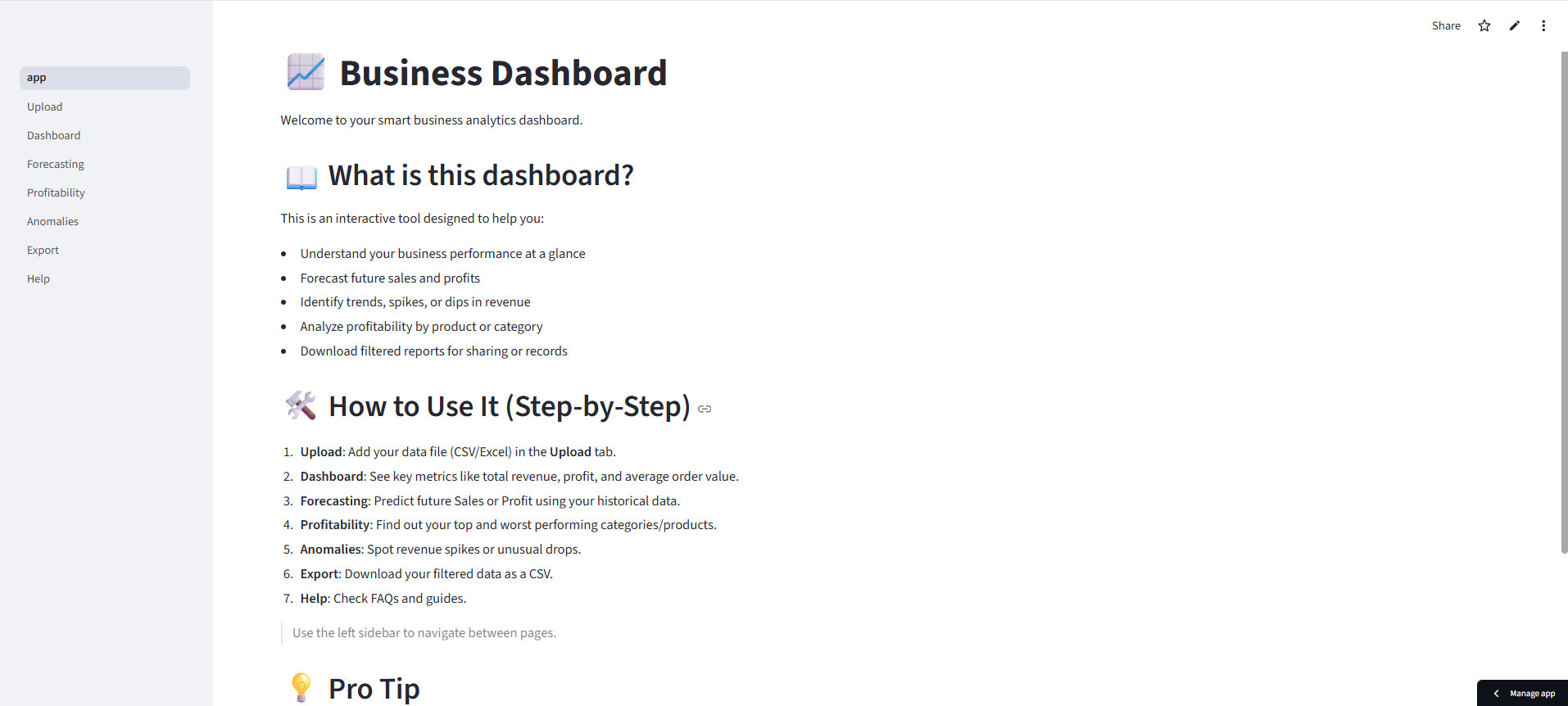
Business Dashboard
A Streamlit dashboard that surfaces trends, forecasts demand with Prophet, and flags anomalies so teams act faster.
Problem
Small teams had sales and profitability data but no simple way to spot trends, forecast, or catch anomalies. Reports were manual and late, so decisions lagged.
Solution
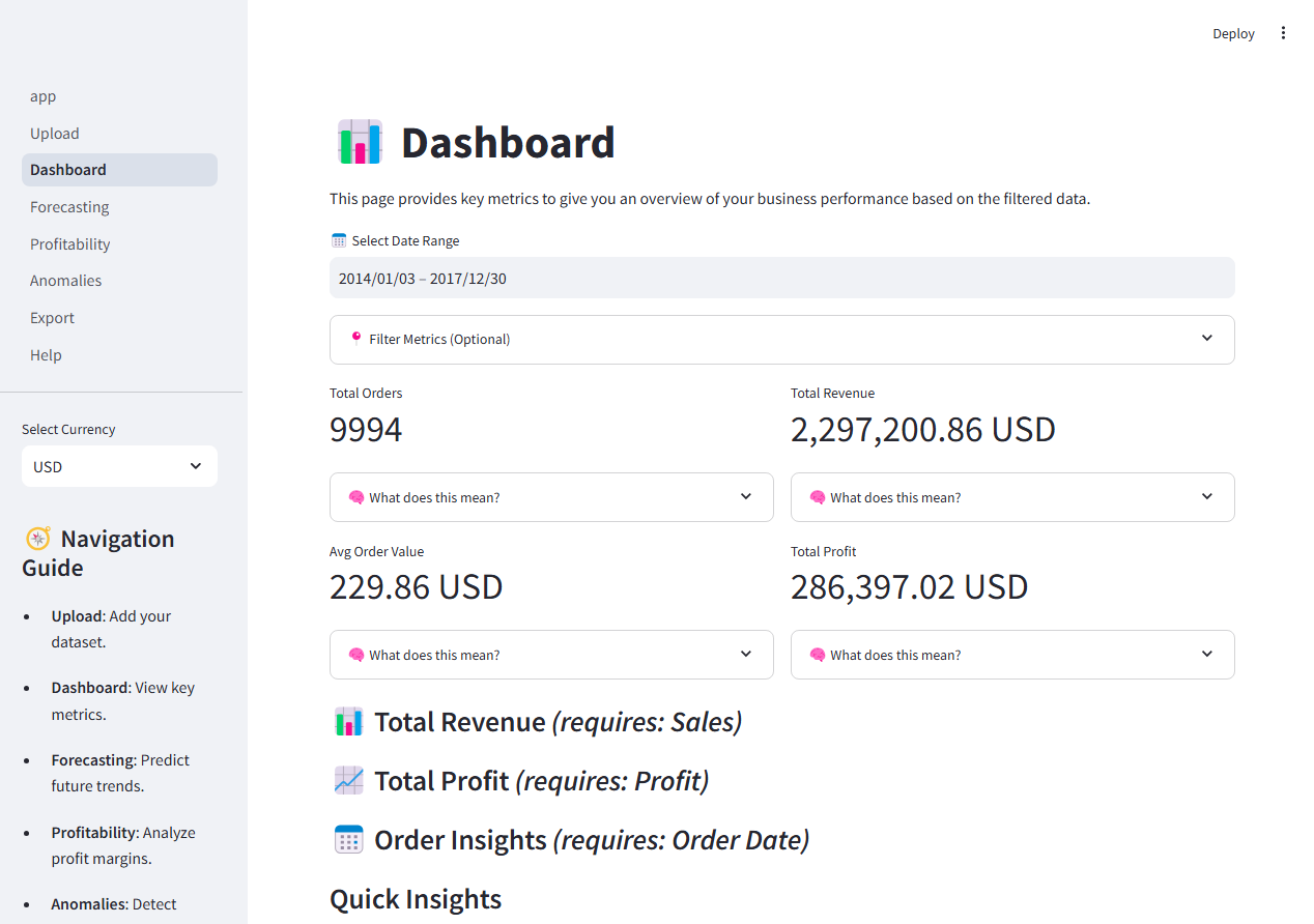
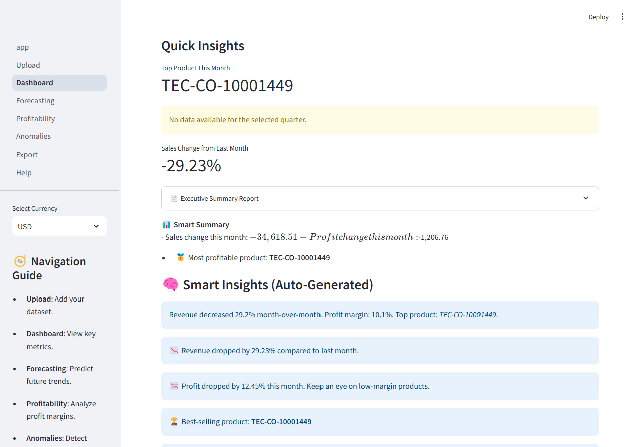
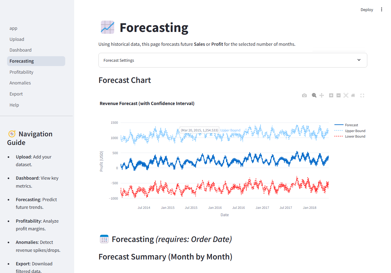
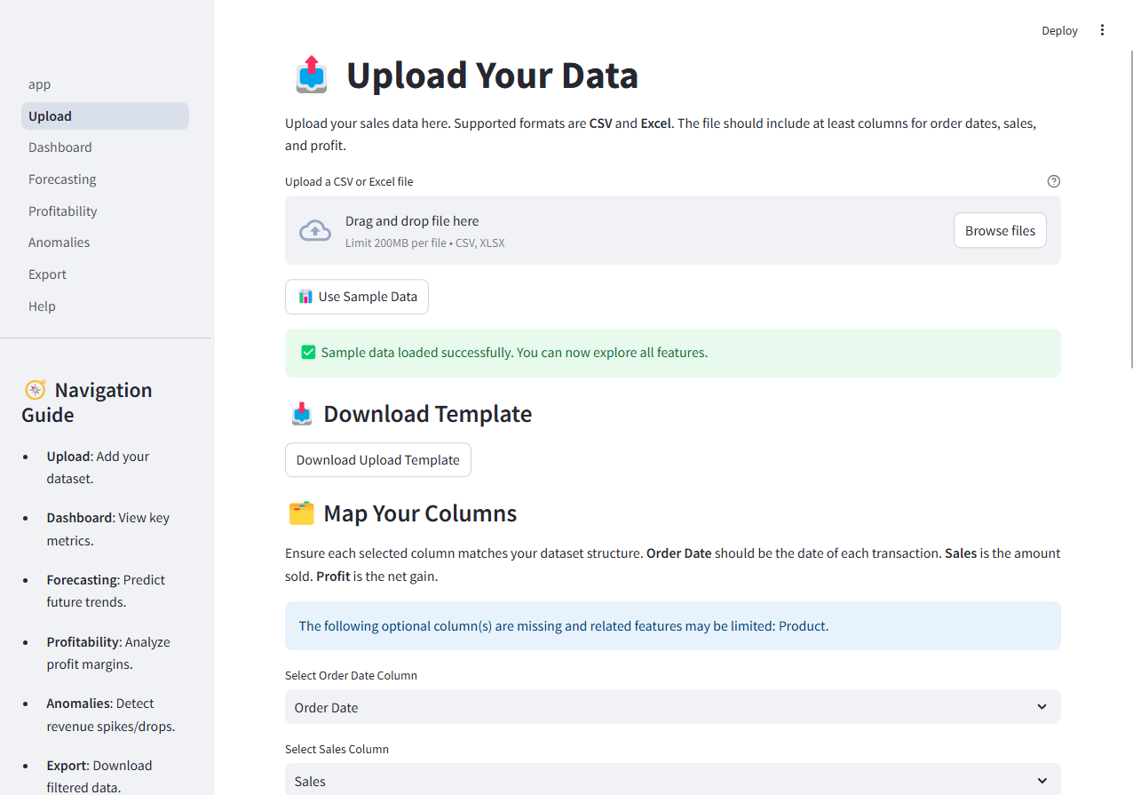
I built a Streamlit dashboard with Prophet forecasting, anomaly detection, and Plotly visuals. Data prep used Pandas with configurable filters and date-grouping. UX prioritized speed to insight: KPIs up top, trends and drill-downs below.
Impact
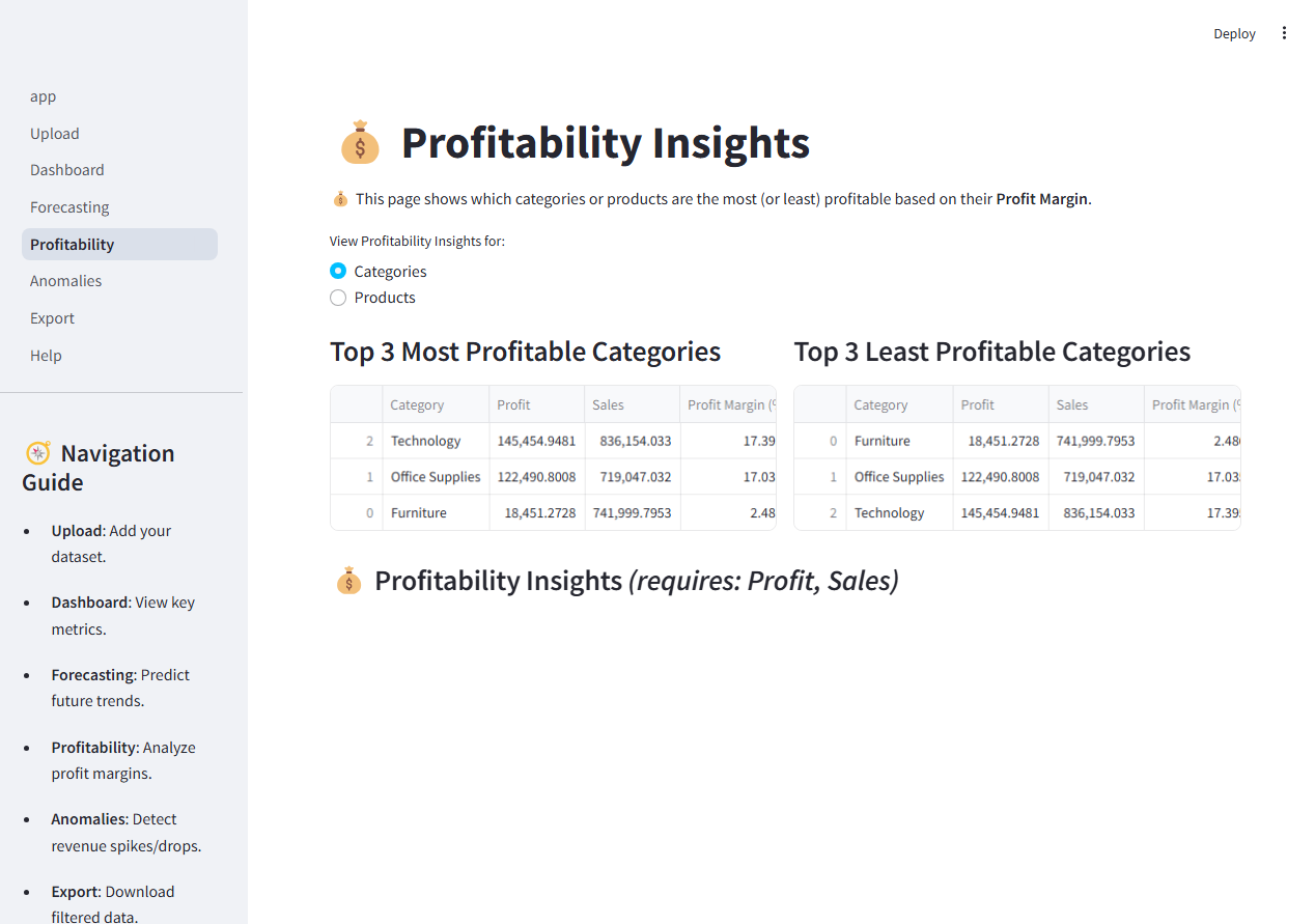
Test users reduced weekly reporting time from hours to minutes and surfaced seasonal patterns they hadn’t seen. The anomaly view helped flag outliers that led to pricing and inventory fixes.
Role & Context
Solo project in ~2 weeks. End users were friends running small operations; I iterated based on their feedback. Tech: Python, Streamlit, Prophet, Plotly, Pandas.
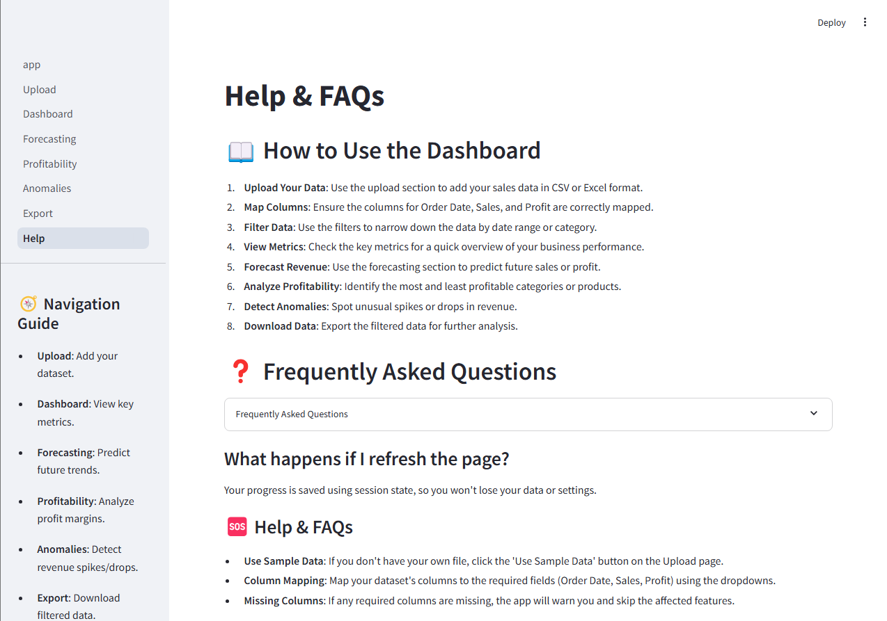
KEY FEATURES
- Time-Series Forecasting: Uses Facebook Prophet for demand forecasting with configurable parameters
- Anomaly Detection: Automatically identifies outliers and unusual patterns in sales data
- Interactive Visualizations: Plotly charts for trend analysis, forecasting, and anomaly visualization
- Data Filtering: Configurable date ranges and grouping options for flexible analysis
- KPI Dashboard: Key metrics displayed prominently for quick insights
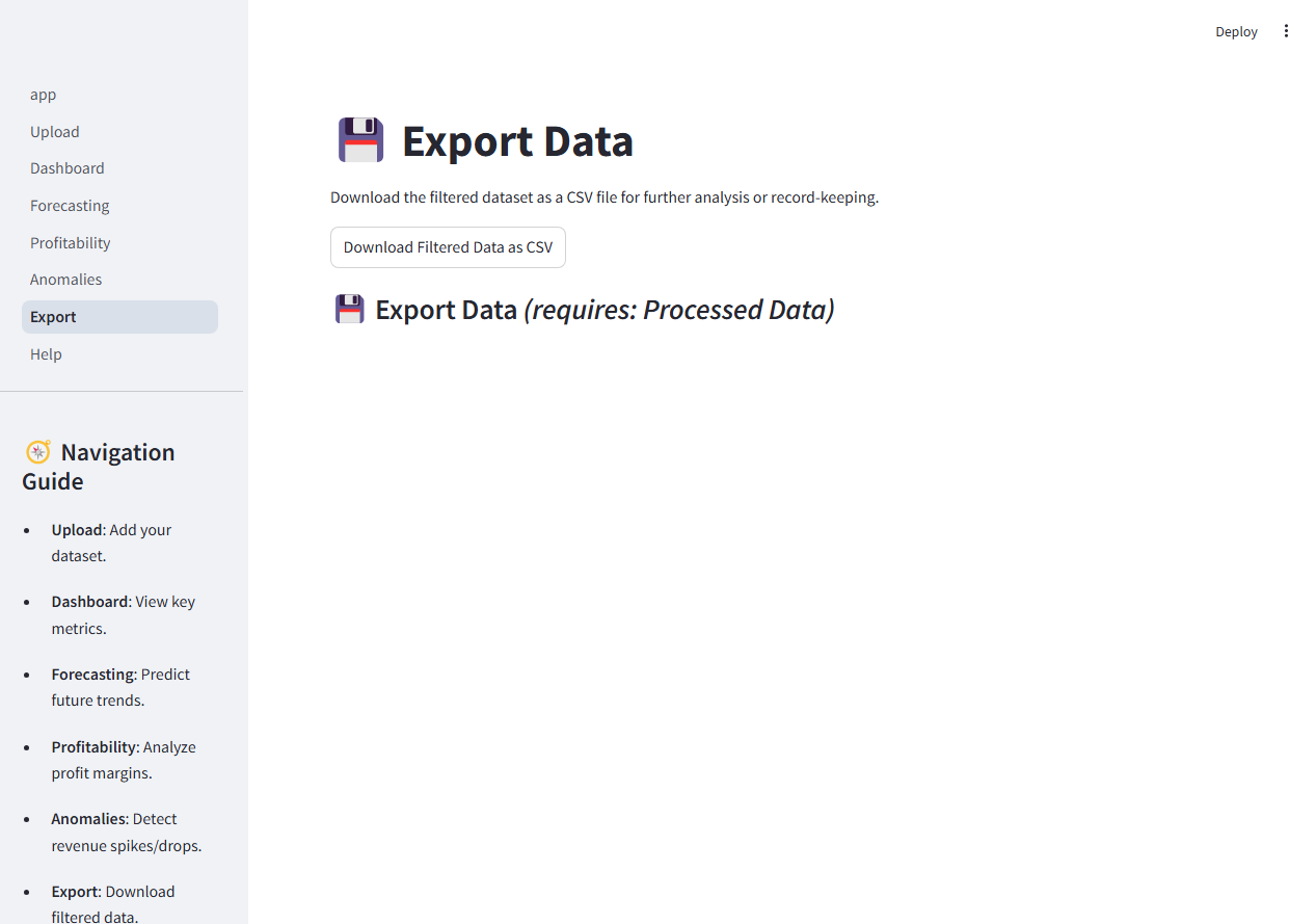
- Export Capabilities: Export forecasts and analysis results
SKILLS DEMONSTRATED
TECHNOLOGIES USED
Demo
Gallery


CHALLENGES & SOLUTIONS
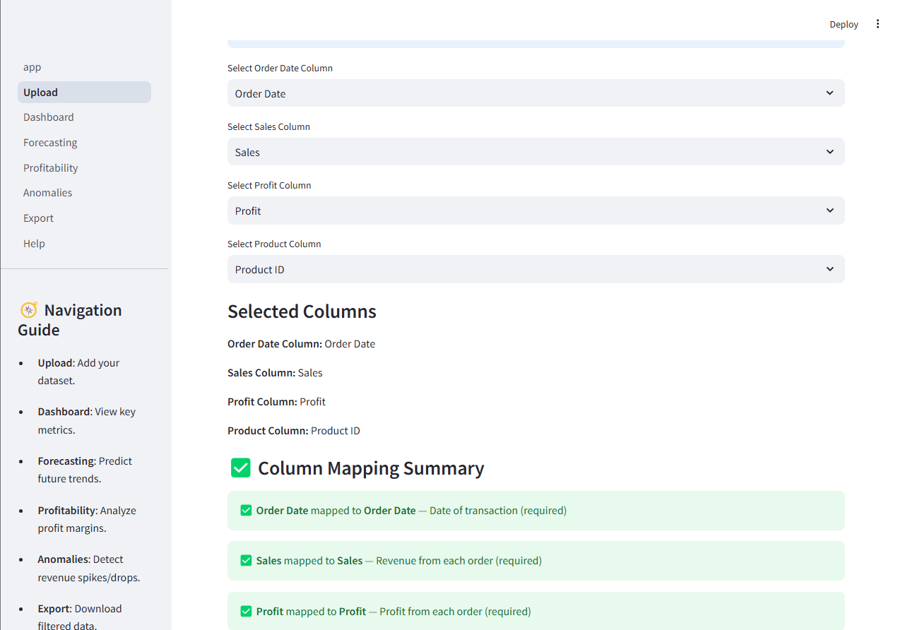
Solution: Implemented robust data cleaning pipelines with Pandas, handling missing values and ensuring consistent date formats before feeding into Prophet.
Solution: Used cross-validation and experimentation to find optimal Prophet parameters, balancing forecast accuracy with computational efficiency.
Solution: Designed clear Plotly charts with interactive tooltips and clear labels, making complex forecasts and anomalies accessible to all users.
Explore Related Projects
Interested in more data analytics projects? Check out these related dashboards: